Company
A New Look for Glide

Sameer Kapur
Cofounder & Chief Product Officer
We built Glide to make banking feel effortless. It was time for the brand to say the same thing.
Today we're launching a new visual identity, a new website, and a clearer way of talking about what we do. This is what we were thinking, what we built, and where we're headed.
Why now
The last few years have been about product. We closed our $15M Series A. We launched Deposit Origination, which takes account opening from 20 minutes to under 3. We put onboarding tools into production at credit unions and community banks across the country.
We also watched the world shift. AI moved from a feature to a foundation. The institutions that will win the next decade aren't the ones that bolt AI onto old infrastructure. They're the ones that rebuild around it. Glide is built for them.
As the product got sharper and the market got clearer, we kept coming back to the same question: does our brand reflect what we're actually building? We decided to make sure the answer was yes.
What we wanted to say
What we wanted to say
We kept landing on one word: ease.
Not simplicity. That's a feature. Ease is a feeling. It's what happens when a loan officer can close an application during a member call instead of apologizing and calling back. It's what a member experiences when they open a checking account in two minutes from their phone. It's what a CFO feels when the reporting just works.
Glide should feel like that. The brand, the website, the product — all of it should move the way good software moves. Without friction. Without effort.
We also wanted to be honest about our customers. The credit unions and community banks that work with us aren't waiting for someone else to go first. They're the ones who look at their industry, see what's possible, and decide to build it. They want to be different. The brand should match that energy.
What we prioritized
Flow over friction. Every visual decision was made against one question: does this feel like ease? Clean geometry. Considered whitespace. Motion that feels intentional, not decorative. The system is designed to get out of the way and let the work speak.
Restraint over noise. We chose a typeface that earns attention rather than demanding it. Precise without being cold. Structured without feeling locked up. It fits the work we're doing: financial services with a software soul.
Forward, not back. The brand is built around where community banking is going, not where it's been. AI-native infrastructure. Real-time decisioning. Staff tools that actually help staff. We wanted the visual identity to feel as modern as the product.
Warmth without softness. Community banking is a relationship business. The institutions we work with know their members by name. The brand needed to hold that — human, grounded — while being direct about what Glide can actually do.
What's new
A visual identity built around motion. The new system uses movement as a core design element. Not animation for its own sake — movement that communicates how Glide works. Things flow. That's the point.
A cleaner type system. We found a typeface that does the thing we needed most: it's readable at every size, it has personality without showing off, and it doesn't look like either a bank or a startup. It looks like Glide.
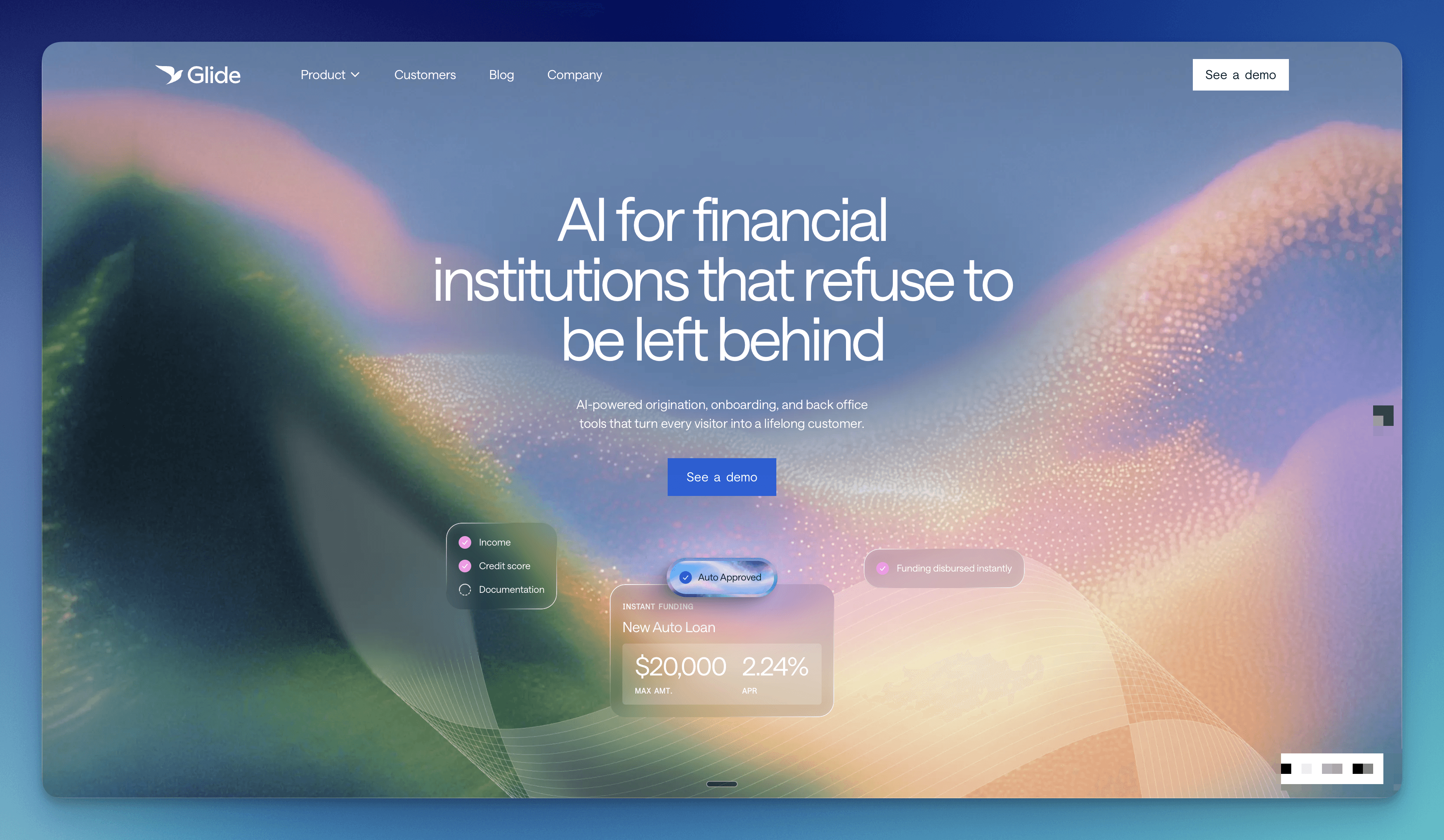
A website that gets to the point. The new site is built for our customers who are done waiting for their vendor's next release cycle. It answers the question quickly: here's what Glide does, here's who it's for, here's how to start.
A sharper voice. Less jargon, more directness. Glide makes your members' lives easier and your staff's jobs better. That's the whole thing.
What's next
The rebrand is the start of a new chapter, not the headline of it.
We're building deeper into AI. That means smarter decisioning, automated workflows, and staff tools that handle the repetitive work so people can focus on the relationships. We believe the community banks and credit unions that adopt AI thoughtfully — not recklessly — are the ones that will grow. We're building the platform to make that possible.
We're expanding the product surface: more account types, more configurability, more of the infrastructure that lets an institution run the way they want to run instead of working around someone else's limitations.
And we're going deeper on what "ease" means for the whole institution, not just the member-facing experience. The back office. Compliance. Reporting. The parts of the job that nobody likes and everyone needs.
There's a lot of work ahead. That's exactly how we like it.
We're proud of this one. If you're at a credit union or community bank ready to build for what's next, let's talk.